September 16, 2024

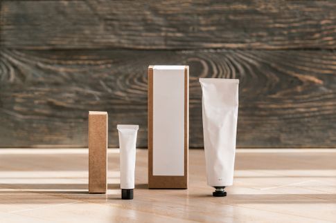
Minimalism is trending everywhere, influencing various industries like interior design and fashion. However, minimalism has the most impact on product packaging.
Many customers prefer minimalist packaging because it suggests a product has only the essential ingredients, with no additives or chemicals, which is especially appealing for food, beauty, or cleaning products. Thinking they are making a sustainable purchase, people often look for such products, even if the packaging sometimes doesn't truly reflect the ingredients.
Brands like Google and McDonald's have successfully adopted minimalism in their branding, garnering positive customer feedback. If you want to exude a luxurious or clean vibe, minimalist packaging is the way to go.
In this blog, we'll explore the rise of minimalist product packaging and provide practical tips on achieving this look for your brand.
The Rise of Minimalism in Product Packaging
In a world saturated with flashy packaging, minimalism is a powerful statement. Here are some reasons why adopting a less-is-more approach can elevate your product and attract customers.
Shelf appeal
Imagine walking through a grocery store filled with products with colorful packaging until your eyes land on one with a clean, simple design.
That's the power of minimalist packaging—it stands out effortlessly and grabs attention with its simplicity. Its clean lines and uncluttered design create a visual focus on the product, significantly increasing its visibility and convincing customers to purchase.
Environmental impact
Nearly 30% of shoppers now buy sustainable products more frequently, while another 36% have made a modest change towards eco-friendly purchasing habits. Fortunately, minimalist packaging aligns with these new consumer preferences.
Minimalist packaging uses fewer materials, allowing you and your customers to decrease your carbon footprint. Additionally, simpler designs are often easier to recycle, further promoting a circular economy.
User experience
Consumers appreciate simplicity, and minimalist packaging delivers just that. It's easy to understand and use, giving products a clean look that improves consumer perception. It highlights only essential information and removes unnecessary details.
One good example is Apple. Its sleek white boxes with a simple product image on top create a sense of sophistication and anticipation. The uncluttered design highlights the product, reinforcing Apple's reputation for innovation and quality. Even the unboxing experience of the minimalist packaging improves the buyer's experience.
Cost-effectiveness
Minimalist packaging can boost your bottom line. It reduces the need for unnecessary materials and complex designs, lowering production costs and simplifying the process. Moreover, products with minimalist packaging are easier to transport and store, saving money on logistics and warehousing.
5 Tips to Do Minimalist Product Packaging the Right Way
Minimalist packaging goes beyond picking a plain box. Use the tips below to create effective minimalist product packaging.
1. Identify the essential elements of your business
Even with a simple design, your packaging should still reflect your brand. Determine what truly represents your business—is it your logo, tagline, or a specific product attribute? Focus on highlighting the essential elements and eliminating everything else.
2. Use sustainable packaging materials
Minimalism and sustainability go hand in hand. Opt for eco-friendly materials like recycled cardboard, kraft paper, or biodegradable plastics. These resources align with the minimalist aesthetic and prove your commitment to environmental responsibility.
Moreover, sustainable materials are easier and cheaper to produce than plastic, glass, or metal. This cost-effectiveness can help your finances in the long run.
3. Use white space
White space is your minimalist packaging design's best friend. It creates a sense of openness and allows the essential elements to breathe. Don't be afraid to leave empty spaces on your packaging because, as they say, less is often more.
4. Aim for simple lines
Clean, simple lines are the foundation of minimalist design. Avoid complex patterns or intricate details. Opt for geometric shapes, straight lines, and a limited color palette for a polished look.
Take the beauty brand The Ordinary as an example. The text on its product packaging is left-aligned against a plain layout for enhanced readability. The brand's minimalist design reflects the simplicity of its ingredients, creating a cohesive and clean look.
5. Experiment with texture
While minimalism is about simplicity, it doesn't mean your packaging has to be boring. Introduce texture for added depth and interest and to give customers a multi-sensory experience. Consider embossed or debossed elements, or choose materials with a natural texture like kraft paper or linen.
For instance, if you mainly sell perfumes with woody or earthy notes, a textured kraft box can evoke the feeling of nature. On the other hand, if you sell high-end skincare products, you can opt for a white, smooth package to exude luxury and sophistication.
Maximize Impact with Minimalist Packaging
Minimalist packaging offers a winning combination of benefits. It reduces costs, attracts customers with its clean aesthetic, lessens your environmental impact, and provides a user-friendly experience. In a crowded marketplace, a fresh packaging approach might just be the edge you need to stand out.
Embrace the minimalist movement and see your product shine. For your minimalist label printing needs, Intermedia Print Solutions is here to help. We specialize in custom packaging solutions, focusing on high-quality, eye-catching designs that ensure your products stand out.
Place an order or request an estimate to get started.


